I’ve always had a bit of a problem with the Flight Path model of recording and reporting student progress in Science.
This model has various forms as shown here but they are all based on the idea that a student joins a secondary school in Year 7 with a Key Stage 2 score in English and Maths. This score is then statistically compared to other students with that score in order to predict the grade they might get at GCSE. This then becomes the student’s target grade. A line is drawn on a graph from Key Stage 2 score to the GCSE target grade and the student is expected to follow it as they progress through the various assessments during years 7 – 11.

The idea is a simple one. It assumes that students will consistently improve during their secondary education in a nice predictable way. The model expects that students will learn their subject to a gradually deepening depth, getting better and better as they progress through their courses towards their GCSEs.
However, anybody who has ever met a child will know that they are not predictable. Their assessment scores throughout the years up to GCSE do not consistently improve over time – particularly in the Science subjects. They fluctuate wildly, so do not follow the nice straight lines of the flight paths.
One of the reasons for this is that in many subjects (Sciences included) students are taught a series of discrete topics which have very little overlap between them. The content they learn in one topic helps very little with learning the content for another topic. Taking GCSE Chemistry for example, learning about the covalent bond doesn’t really help a student to learn about factors affecting the rate of a reaction. The two topics are entirely separate. One does not build upon the other. So, we cannot really expect a student’s test score to improve from one topic to the next.
What we should expect, is that students learn each topic well enough to be able to reach their target grade in every topic test. With progress being seen as a widening breadth of knowledge across the variety of topics rather than a deepening depth. This model more closely represents reality. It assumes that each topic is discrete and only studied once during the GCSE course. It shows progress over time as an expanding breadth of knowledge to a particular overall grade, measured as an average grade achieved across the different topics studied.
Great, so how to we show this visually?
I’ve recently been using Radar Charts. Sometimes called Spider Charts, Polar Charts or Web Charts, these are a great way to show a student’s performance in a variety of different topics compared to a target.
Take the example of fictional Yr11 student Tameka. Tameka has a GCSE Biology target of grade 6. This was given to her by her secondary school and is based on how she performed in her primary school. Whatever we think about target setting is not the issue here. It is how Tameka’s current school will measure her P8 score so for now we’ll go along with it. If Tameka had sat her GCSE Biology exam while she was in Year 9 she probably wouldn’t have got anywhere near her target grade. As Tameka was taught the content of her Biology GCSE course throughout Years 10 and 11, she gradually picked up enough of this knowledge in order to take her GCSE exams and have the best shot at getting her target grade.
Tameka and her teachers could have used a Radar Chart to plot her progress through the course, identifying areas of strength and weakness in order to maximise the effectiveness of her exam preparation.


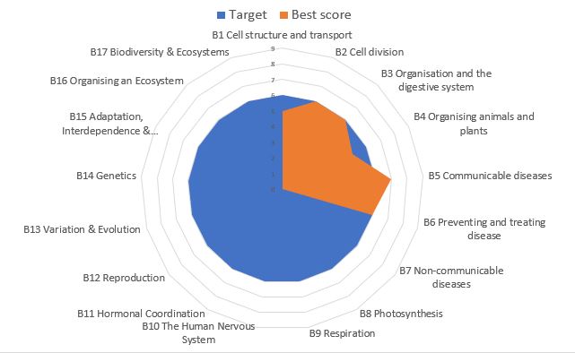
At the start of her GCSE course we know very little about her attainment other than her target of grade 6. So we can plot this on her chart. Here we see the chart as a series of spokes on a wheel, with each spoke representing the different topics in the course. The length of each spoke measures the score from 0 to 9 on the GCSE grading scale. Since her target grade will be the same for every topic, the chart so far resembles a circle with the target grade as its radius.
Over the next term she studies the first two GCSE Biology topics of B1 Cells and B2 Cell Division. After each topic she sits a published test along with the rest of her class which is marked, moderated and graded using published grade boundaries. She scored a grade 5 in the first topic and grade 6 in the second. These can be added to the chart as the first two orange spokes superimposed over the top of the blue Target spokes.

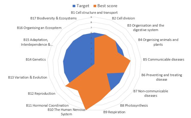
As the course progresses, Tameka continues to study each topic then sit a summary test. Her scores are added to her chart each time. The chart builds up over time to show how Tameka is expanding the breadth of her knowledge. These Radar Charts are also able to highlight Tameka’s strengths and areas in which she could do with a bit more support. For example, she scored very highly in her topic 10 test – The Nervous System, but much less well in topic 7 about Non-Communicable Diseases. It may transpire that Tameka had a lot of absence while her class were studying topic 7, or perhaps topic 10 really interests her.
By the end of the GCSE course, Tameka has an entire visual map of her progress which will allow her to focus her revision on certain difficult areas while also allowing her teachers to give additional targeted support where she needs it most.
When I first floated this idea on Twitter I had a bit of interest from teachers asking how to produce these Radar Charts using MS Excel. So, I’ve produced a template file that any teacher can use with their own class, or any student can use with their own subjects.
This template file is offered free of charge. Simply download your own copy and amend it to suit your needs.
Instructions for Use:


- The file in it’s current format is set up for GCSE AQA Biology with a class of up to 32 students.
- It is protected to prevent accidental change to any of the formulae, although there is no password so feel free to unprotect it and edit it to suit your own needs.
- The first task will be to name your class and students.
- Select each cell across row A in turn to rename the class (11A1) and your students from your classlist.
- If you are a student using this to monitor your own learning, you could rename each “student” to be a subject that you are studying.
- You’ll also need to rename each of the Charts in the students’ individual tabs as well as the tabs themselves.


- Now you can start to add data to each student’s record on the “data” tab.
- Only the white formatted cells require editing. Other cells will autofill using the formulae already written into them.
- Select and enter a target grade (9-1) into the white cell at the top of each Target coloumn (shown with the red ring in the image above).
- Test scores (9-1) can be entered into the next two columns (shown with the yellow ring above). Each student can have two attempts at each test. The formulae in the spreadsheet will select the highest of these two scores to plot on the Radar Charts.
- Repeat these data entries for all other students in the class or for all subjects being studied.
- To edit the topics, simply select and rewrite the cells in column A. All charts will update automatically.
- You will need to unprotect the sheet first by selecting the “Unprotect Sheet” option from the Review tab at the top of the screen. There is no password to worry about.
- Once unprotected, the whole workbook can be editted, including all the charts.
Have a play with it. If you get stuck there are some useful tips in the Excel Help files, or elsewhere online. How to Geek has some fairly straightforward instructions on creating Radar Charts for example. If all else fails you can always download a fresh file from here.
Please do let me know what you think in the comments below or via my Twitter profile @Pu94Science.
Good luck and happy charting.
Pu.

Heya! I’m at work browsing your blog from my new iphone 4! Just wanted to say I love reading your blog and look forward to all your posts! Keep up the excellent work!
LikeLike
Thanks so much. I’m pleased that you enjoy it.
LikeLike
I just added this webpage to my google reader, great stuff. Cannot get enough!
LikeLike